Analyzing your team’s time
The Team schedule makes your team’s workload visual. It’s a color-coded display of each person’s schedule, availability, overbookings, and time off that we call the heat map. This bird’s-eye view can help you make decisions to reassign time, extend or shorten a project’s time frame, or even hire new people.
You can get to your Team view by heading to the Schedule and clicking the Team button in the top left of your screen.

Choosing a heat map view
Forecast offers a few different options for analyzing your team’s time: daily, weekly, and monthly availability, and weekly and monthly capacity. If your Forecast account is connected to Harvest, you’ll also be able to see your team’s weekly or monthly actuals (tracked time in Harvest). Use the heat map dropdown at the top of the Team schedule to choose the option that works best for you. Note that the options available depend on whether you’re in the Day, Week, or Month view.
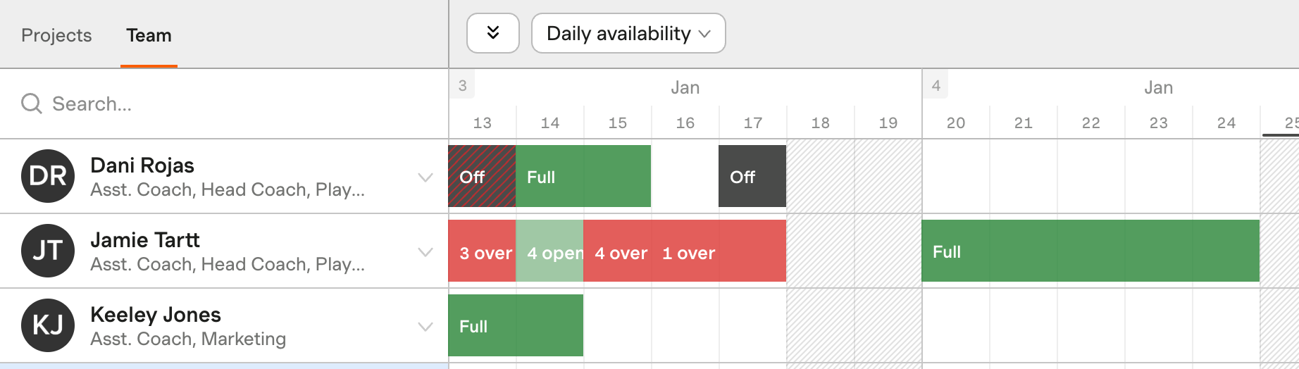
Viewing daily availability
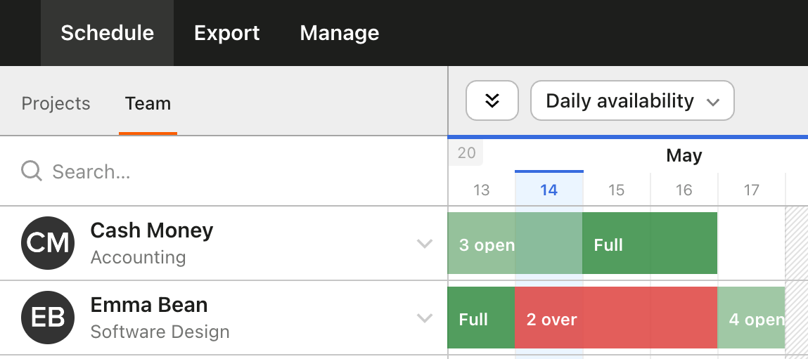
You can view your team’s daily availability by selecting Day from the dropdown near the top right and Daily availability from the heat map dropdown.
This view will show you the number of hours per day a person is available or overbooked. It’s best used to locate available hours to schedule on a daily basis.
Viewing weekly availability
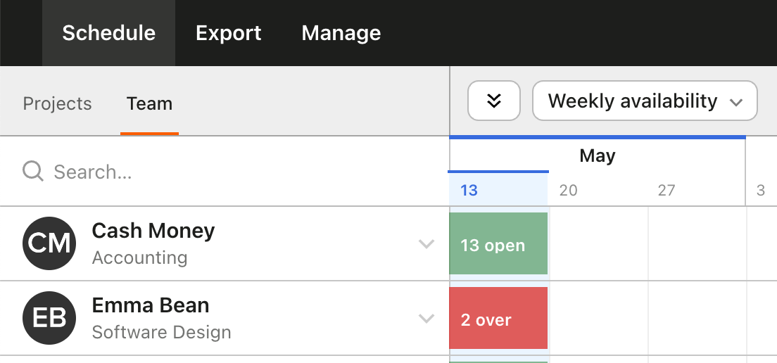
You can view your team’s weekly availability by selecting Week from the dropdown near the top right and Weekly availability from the heat map dropdown.
This view will show you the number of hours per week a person is available or overbooked. It’s best used to locate available hours to schedule on a weekly basis.
Viewing weekly capacity
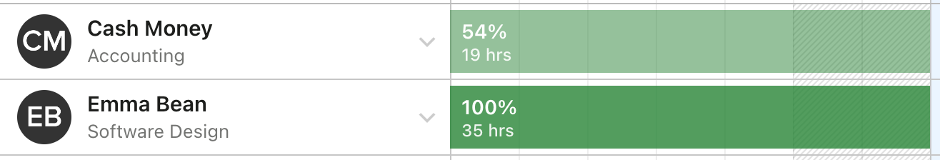
You can view your team’s weekly capacity by selecting Day or Week from the dropdown near the top right and Weekly capacity from the heat map dropdown.
This view will show the total number of hours a person is booked for a given week. It also shows a capacity percentage—that is, the person’s total scheduled hours for that week divided by their total capacity. This is best used if you plan by weekly assignments.
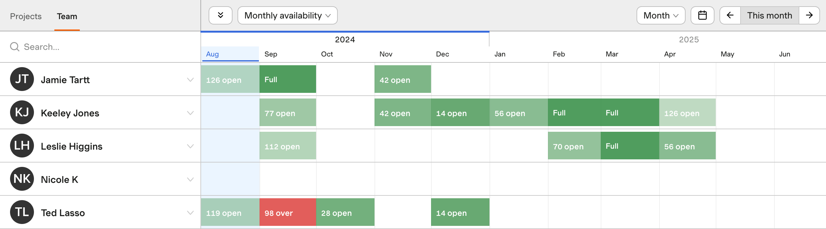
Viewing monthly availability
You can view your team’s monthly availability by selecting Month from the dropdown near the top right and Monthly availability from the heat map dropdown.
This view will show you the number of hours per month a person is available or overbooked. It’s best used to locate available hours to schedule on a monthly basis.
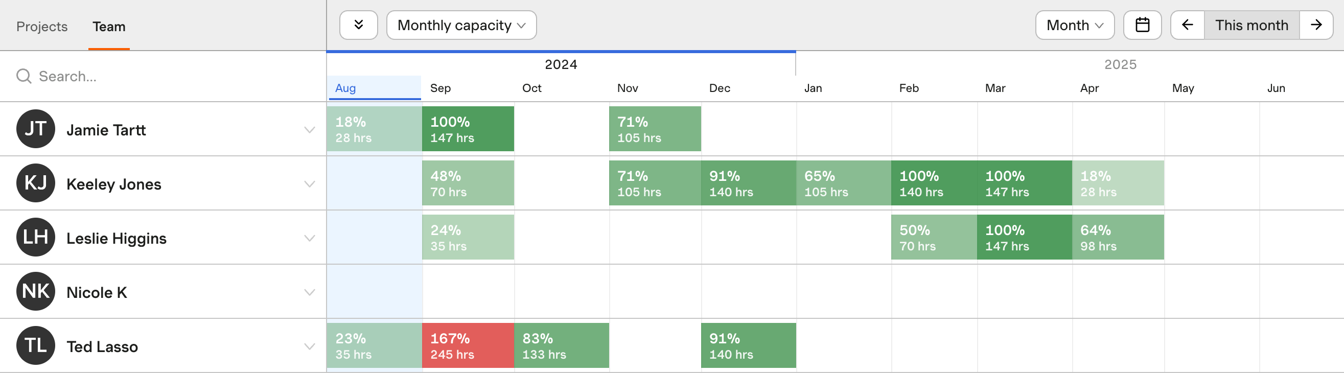
Viewing monthly capacity
You can view your team’s monthly capacity by selecting Month from the dropdown near the top right and Monthly capacity from the heat map dropdown.
When selected, this view will show the total number of hours a person is booked for a given month. It also shows a capacity percentage—that is, the person’s total scheduled hours for that month divided by their total capacity. This is best used if you plan by monthly assignments, or if you’re trying to answer high-level questions about your team’s overall availability.
Viewing weekly or monthly actuals
You can see your team’s actual tracked time pulled in from Harvest by selecting Weekly actuals (Day or Week view) or Monthly actuals (Month view) from the heat map dropdown.
When viewing Weekly actuals or Monthly actuals, you’ll see:
- The total hours that person has tracked in Harvest to any linked projects for the given week or month
- Hours tracked to projects that aren’t linked between Harvest and Forecast aren’t included in this total
- The percentage (%) of actual hours against the scheduled hours by week or month
- The total scheduled hours for the week or month (when hovering over the percentage)
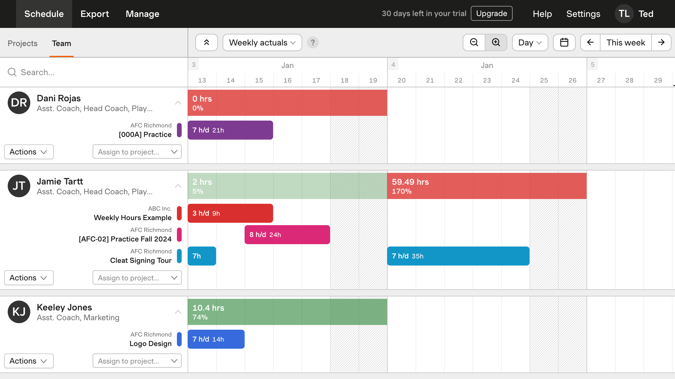
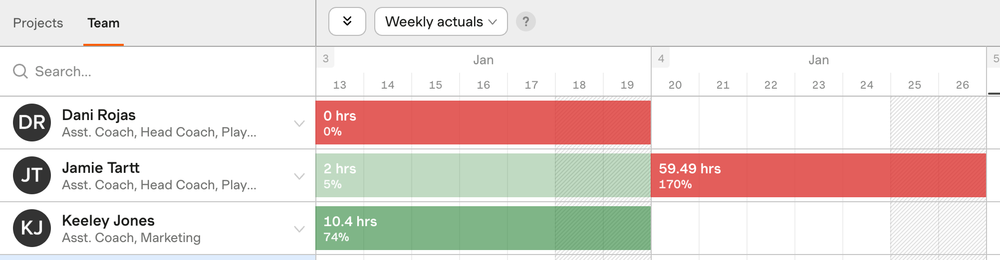
In the above example, Jamie’s scheduled for 40 hours the week of January 13 - 17, but has only tracked 2 hours so far in Harvest, which is 5% of that estimated total.
The following week, Jamie’s scheduled for 35 hours, but has tracked a total of 59.49 hours in Harvest. This means he’s actually tracked 170% of his scheduled time.
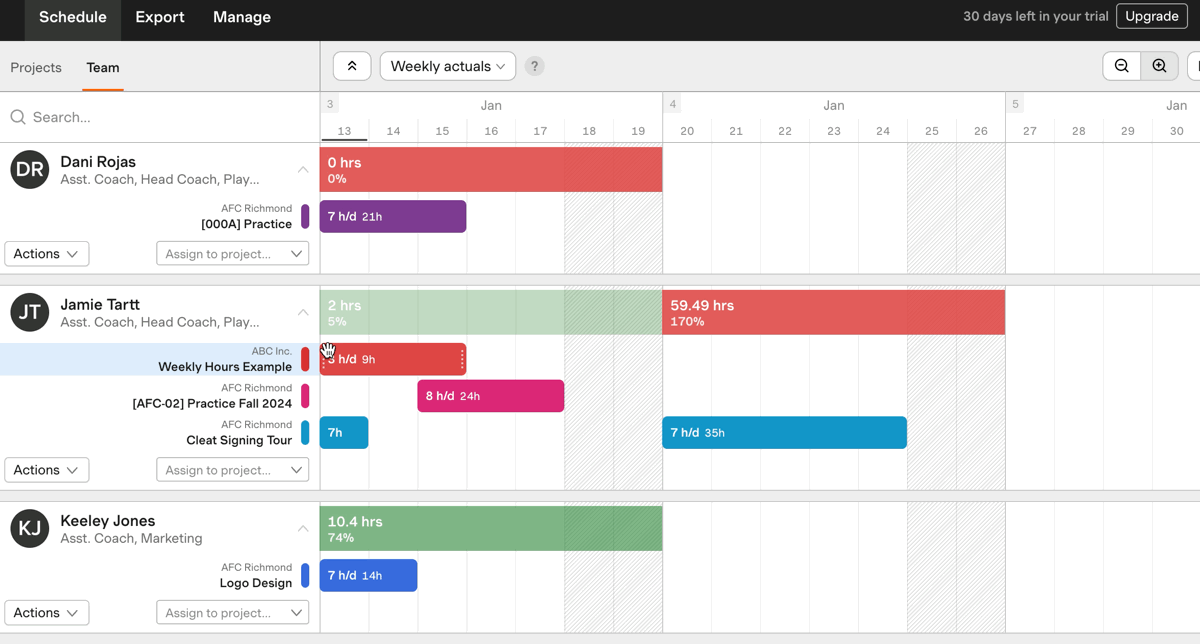
You can hover over the percentage to see the estimated total of scheduled hours in Forecast for the given week or month:
Analyzing the heat map
The colors of the heat map change as time is assigned to a person. In general, green means a person hours are less than or equal to their capacity, while red means their hours are greater than their capacity. A darker shade means more hours. There are a few distinctions beteween how to read the heat map depending on the view (capacity/availability vs. actuals).
Weekly/monthly capacity and availability
The colors of the heat map change as time is assigned to a person—the darker the shade, the more hours assigned. The colors used are the same for all heat map views, and an alternative color scheme is available for people with red-green color blindness.
- Green means that a person’s schedule is in the clear—they’re not overbooked. The darker the green, the fuller a person’s schedule. You can customize each person’s default number of hours for the week, as well as the days of the week they’re available to work. We use these to measure a person’s daily availability.
- Red means a person is overbooked. You may want to reassign that time.
- Black indicates a person has enough Time Off scheduled to be off for their whole day.
- Gray with red stripes indicates a person’s Time Off conflicts with an assignment. You may need to edit their schedule to fix that conflict.
Weekly/monthly actuals
The Weekly/monthly actuals view works similarly, but changes color based on how the actual tracked time compares to the person’s scheduled hours.
- Green means the person has tracked fewer hours in Harvest than they’re scheduled for in Forecast, or their actual hours equal their scheduled hours.
- A lighter green indicates the person still has a large gap between their scheduled hours and actual hours, i.e. a low percentage below 100%.
- A darker green indicates they’re close to matching their scheduled hours, i.e. a high percentage below or equal to 100%.
- Red means one of two things:
- The person has tracked more time in Harvest than they’re scheduled for in Forecast, i.e. a percentage above 100%.
- A past week or month has no tracked time but had scheduled hours in Forecast, meaning they’ve tracked 0% of their scheduled hours.
- Current or future weeks/months won’t appear red, even if there’s no tracked time yet.